Ever wondered why some art displays grab your attention more than others? It’s not by chance. The way artworks are arranged in museums and galleries is a careful science and art rolled into one – that’s exhibition design at work.
Exhibition design blends ideas from psychology to determine where each piece sits and your path through the exhibition. It uses what we know about how people think and react, plus expert knowledge about art, to make spaces where you can really connect with what you’re seeing.
These principles aren’t limited to museums and art galleries – they’re applicable everywhere. Forward-thinking businesses use exhibition design in their offices and public spaces to strengthen their brand image, enhance employee well-being, improve talent retention, and create memorable experiences for clients and visitors.
By learning to use these ideas, companies can change how art functions in their spaces. Instead of just filling walls, artwork can actively contribute to a business’s aims and culture
Visual Attention and Spatial Layout
Exhibition design draws on research about how we process visual information in complex spaces to make the space more engaging and interesting. Studies show that when we enter a room, our attention doesn’t spread evenly. Instead, it follows patterns based on things like movement, contrast, and how objects relate to each other in space.
This fundamental understanding underpins several key approaches in exhibition design. These approaches – the vista approach, co-visibility, and cognitive load management – are straightforward to understand and implement in various commercial settings. Let’s explore each of these techniques and how they can be applied to create more effective spaces.
Vista Approach
The vista approach creates intentional sightlines and focal points to guide visitors through a space. Designers might place a visually striking piece at the end of a long gallery or main corridor. This visual anchor draws visitors forward, encouraging exploration of the entire space. It works by tapping into our natural curiosity about new things in our environment.
What makes this approach so effective is how it creates a sense of anticipation and discovery. As you move through the space, you’re drawn towards new views, each revealing a carefully chosen artwork or display. This guides the flow of people and paces the experience, gradually revealing the exhibition’s story or theme.
When using this approach, designers think about things like the size of the artworks, lighting, and how walls or partitions are arranged. They often use large-scale works as focal points and play with lighting to highlight key pieces and create contrast with surrounding areas.
The key is to identify what will serve as focal points and arrange the space to reveal these elements bit by bit, keeping interest high and guiding movement throughout the environment.

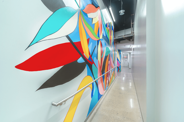
This vibrant mural by Eric Inkala exemplifies the vista approach by drawing viewers along the corridor and encouraging exploration of the space.
Co-visibility
Co-visibility is all about how visible artworks are in relation to each other when seeing multiple works together. This setup lets viewers compare different pieces and make connections between them. It can show similarities in style, theme, or technique across various works, or it can highlight contrasts.
High co-visibility works particularly well when presenting a series of works, showing how something has changed over time, or grouping works by theme. When you want to make each piece feel more intimate, letting viewers focus on one work at a time without distractions, use the low co-visibility approach by isolating works or reducing how much they visually relate to each other.
When implementing co-visibility, designers think about things like sight lines, lighting, and physical barriers. They might use open floor plans and consistent lighting for high co-visibility, or create secluded spaces and focused lighting for low co-visibility.
Cognitive Load Management
Cognitive load theory looks at how much new information our brains can handle, especially in unfamiliar places. In exhibition design art spaces, cognitive load focuses the mental effort needed to understand and engage with the displayed works and accompanying information. If the cognitive load is too high, it can lead to mental fatigue, reduced engagement, and trouble remembering information.
To manage cognitive load, designers carefully balance the amount of visual and textual information presented. They think about:
- How many works to display: Too many can overwhelm viewers, while too few might not provide enough engagement.
- Information density: How much and how complex the accompanying text, labels, or multimedia elements are.
- Pacing of information: How information is spread out through the exhibition space.
- Use of negative space: Areas with minimal stimuli that allow for mental rest and reflection.
Some exhibition spaces even include “slow looking” areas. These are designed with minimal distractions to encourage prolonged engagement with a single work. These spaces provide a break from information-rich areas and let viewers process what they’ve seen.
When cognitive load is managed effectively, viewers stay engaged throughout their visit. They’re able to absorb and reflect on the presented information without feeling overwhelmed.

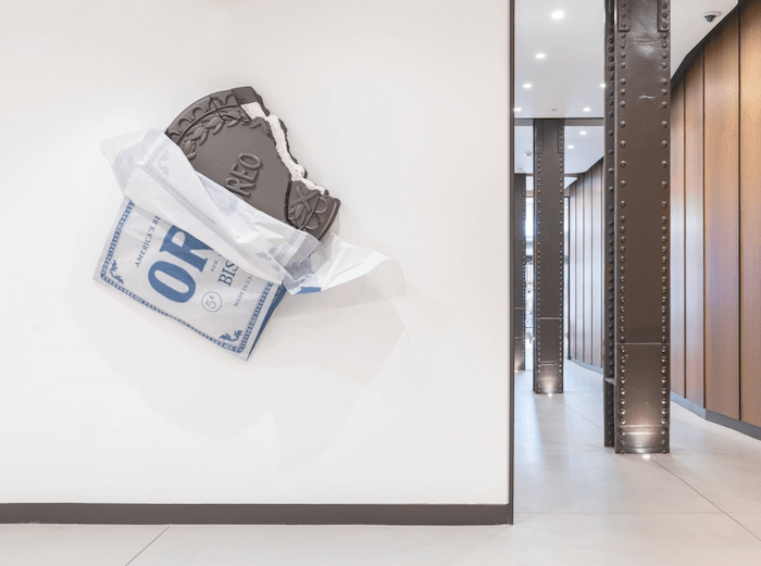
This sculpture by Sam Lasseter exemplifies cognitive load management in exhibition design, capturing attention without overwhelming viewers.
Color Theory in Exhibition Design
Color has a psychological impact that affects how people perceive time, space, and even temperature. Choosing the right color scheme in art can suggest the mood and guide behaviors of customers, visitors and employees.
In commercial spaces, the use of cool colors like blues and greens in artwork often makes areas feel calmer. This effect is particularly useful in spaces like break rooms where people go for a respite from their crazy work days.
Conversely, warm colors like reds and oranges in art pieces tend to create a sense of closeness and activity. This quality makes warm hues particularly effective in retail spaces or areas where businesses want customers to linger and examine products closely. The energy conveyed by warm-colored artwork can draw people in, encouraging interaction and engagement.
Colors can also carry cultural significance, which is an important consideration for businesses with diverse customer bases. What a color communicates isn’t universal – it can vary widely across different societies and cultures. For instance, while white might represent purity and cleanliness in Western cultures, it’s associated with mourning in some Eastern cultures. Red might signify luck and prosperity in Chinese culture, but danger or warning in many Western contexts.
This cultural dimension of color adds a layer of complexity to art selection for businesses operating globally or in multicultural environments. It requires careful consideration to ensure that the artwork’s color scheme doesn’t inadvertently send the wrong message to certain groups of customers or employees.
Business should also consider how colors interact with each other because it can affect how people perceive a space. For example, a piece of art with subtle green tones might stand out more when placed against a red wall, due to the contrasting nature of these colors. The same artwork might blend in more seamlessly when placed on a green wall.
It’s not just about choosing individual art pieces, but also about considering how those pieces will work together with the existing color scheme of the space. This principle isn’t just about art either. It applies to everything from product displays in retail environments to the design of marketing materials and digital interfaces.
——————-
These principles are among the most important and accessible for businesses looking to create more impactful spaces. However, achieving the greatest impact often requires deeper knowledge and expertise.
If you have a commercial space that you want to use to reinforce a particular message or brand, consider reaching out to experts in the field. Art consultancies are a valuable resource in this regard. They possess extensive knowledge of art trends, color theory, and spatial design. These firms maintain networks of artists and have the expertise to select and place the right art to convey your message effectively.
Art consultancies can streamline the process, helping you make the most of your budget while handling everything from strategic design and procurement to installation. Their comprehensive approach ensures a cohesive and impactful integration of art into your commercial space.
By leveraging the expertise of art consultancies, businesses can create environments that not only look visually appealing but also strategically support their goals and brand identity.
(Learn more about art consultancies at ATP.art)
