Sunlight pours into the corporate office, highlighting the sleek architecture and the focused energy of your team. Yet the walls remain bare, an untapped canvas that could enrich the workspace. Many companies hang art because it’s visually appealing or has some historical significance to the area. But just placing pleasing images misses an opportunity to truly enhance your business environment.
Art has a unique ability to convey complex ideas and emotions in ways that words alone often can’t. Art engages people through symbolism, color, form, and style. Symbolism allows you to represent abstract concepts visually, making intricate ideas more understandable. Colors influence mood and perception; specific hues can create a welcoming atmosphere, promote focus, or inspire creativity. The style of the artwork—whether minimalist, abstract, or traditional—can reflect your company’s industry, heritage, or future aspirations.
In the corporate setting, art can have real, measurable impacts on a company’s performance. Art that reflects company values helps maintain a consistent corporate culture, which can reduce employee turnover and cut recruitment costs. For clients, the right art makes a lasting impression, potentially leading to more business deals and higher-value contracts.
Office art also affects daily operations. Studies show it can boost employee productivity, meaning more work gets done and more revenue for the company. It can lower stress levels too, which often translates to fewer sick days and lower healthcare costs. Inspiring artwork can spark innovative thinking, resulting in better problem-solving and possibly new revenue streams.
These benefits aren’t just theoretical. They can significantly influence a company’s financial performance. By choosing the right art, businesses can create an environment that looks good and contributes to their bottom line.
But how do you choose the right art for your business? What aspect of your company should you focus on? Let’s explore the role of art in the workplace and offer guidance on choosing pieces that align with your company’s goals. Whether you’re redesigning your headquarters, revitalizing a retail establishment, or updating a small office space, understanding the impact of office wall art can lead to a more engaging and productive work environment.
Selecting the Right Office Wall Art

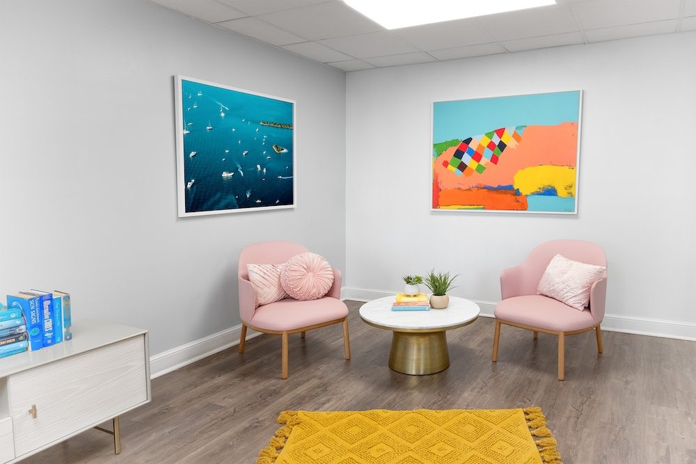
A vibrant office lounge with modern art pieces can create a dynamic and welcoming atmosphere, perfectly aligning the visual appeal with the workspace’s purpose and company culture.
When selecting artwork for your office, begin by thinking about the visual impact you want to create, keeping in mind both the aesthetics and the message the art will send. You don’t need an in-depth knowledge of art theory to make choices that will resonate with your company’s values and workplace culture—just a practical approach to how art can reflect what your business stands for.
Start by considering the color palette of your space. Colors have a significant influence on mood and atmosphere. For a high-energy, creative environment, brighter hues like reds, oranges, and yellows can stimulate focus and innovation. On the other hand, blues and greens tend to create a calming effect, fostering a sense of professionalism and focus. Consider whether the colors in your artwork should align with your brand’s existing color scheme or whether they should offer contrast. If your brand already uses muted tones, for instance, choosing bolder, contrasting art can bring visual interest and energy to the office.
Next, think about artistic styles. Different art styles speak to different business identities. If your company values innovation and forward-thinking, you might lean toward abstract or contemporary pieces that challenge traditional forms and encourage creative thinking. For more formal industries, such as finance or law, classic or minimalist art might be a better fit, reinforcing a sense of reliability and professionalism. Don’t be afraid to explore eclectic combinations—just ensure that the overall aesthetic remains coherent with the broader office environment.
Finally, consider symbolism within the art. You can use shapes, figures, or themes that subtly communicate your company’s core values. For instance, geometric patterns often symbolize structure and precision, which may resonate with businesses focused on accuracy or technology. Nature-inspired artwork, on the other hand, could reflect a commitment to sustainability or growth. The key is to think about the story you want the artwork to tell and how those elements can subtly reinforce that message without overpowering the space.
By focusing on these three aspects—color, style, and symbolism—you can select artwork that not only enhances the visual appeal of your office but also reflects the values and culture your company embodies.
Assessing the Physical Space and Office Design
When selecting office wall art, the environment where the art will be displayed is just as important as the artwork itself. Before you hang the first piece, understanding how art shapes and is shaped by its surroundings can make the difference between a cohesive office environment and one that feels disjointed. Every wall, light source, and architectural feature plays a part in how art alters the workspace.
“Start by thoroughly assessing the wall spaces available for artwork. Consider the size and shape of each wall, as these factors will help determine the scale and orientation of the pieces you choose. Larger walls may benefit from bold, expansive works that draw attention and command the space, while smaller or narrow walls might require more subtle or vertically oriented pieces. The positioning of walls in relation to natural light sources, furniture, and high-traffic areas should also influence your decision. For example, walls in prominent locations—such as those facing entryways or conference rooms—might benefit from more striking, impactful art, while quieter spaces like individual offices or break areas may be better suited for more calming or detailed works.”

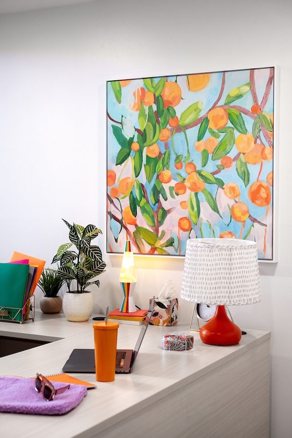
Properly assessing wall space and lighting helps this vibrant piece stand out, enhancing both the art and the overall design of the office.
Once you’ve chosen the ideal wall, the next consideration is lighting—natural and artificial—which can make or break how art is perceived. Some offices are bathed in natural light, while others rely mostly on artificial sources like fluorescent or LED lighting. Natural light, whether soft and diffused or harsh and direct, interacts with art in different ways. Soft daylight can bring out subtleties in the colors, while direct sunlight might wash them out or cause glare, especially on glass-framed pieces. If your office gets strong sunlight, consider selecting canvas pieces or prints without reflective surfaces, or use non-glare glass to minimize reflections.
In spaces dominated by artificial light, it’s equally important to assess how different types of bulbs—fluorescent, LED, or incandescent—affect the artwork. Fluorescent lights, for example, tend to give off cooler tones that can alter how warm colors appear, potentially making them look more muted. On the other hand, warm LED lighting can make artwork feel richer but may distort cooler tones.By selecting art that suits the office’s lighting conditions and incorporating spotlights or accent lighting, you can make sure your pieces stand out as intended.
Once you’ve chosen the perfect spot, the next decision is size and format. Large canvases or multi-panel works can fill expansive spaces, providing a bold focal point that commands attention, while smaller, detailed pieces work best in cozier areas like conference rooms or private offices. Striking a balance between different sizes is important—variety adds interest, but cohesion keeps the space feeling connected. A consistent approach to framing or selecting artwork with complementary colors helps maintain that unity across the office, ensuring the space feels thoughtfully curated rather than cluttered.
Maintaining Quality and Longevity

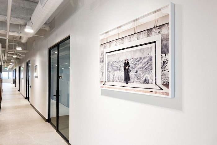
In high-traffic areas like hallways, selecting durable materials such as metal or framed canvas can help art withstand daily exposure while maintaining its aesthetic appeal over time.
After all the effort in selecting the right themes and colors, the last thing you want is for your chosen artwork to deteriorate or lose its appeal over time. Beyond visual considerations, material quality and environmental conditions play a significant role in determining the longevity of art in an office setting. Whether it’s a high-traffic lobby or a quiet executive office, the durability of artwork depends on the right balance of materials and how well they’re suited to the conditions they’ll face.
Hallways and lobbies don’t just house art—they put it to the test. With people constantly passing by, these pieces need to withstand more than just a glance.Canvas prints or metal artwork offer an advantage in these areas due to their resilience. Metal prints, for example, are scratch-resistant and can withstand moisture or accidental contact better than traditional framed works. Similarly, canvas prints—while they provide a softer aesthetic—are generally more durable than paper-based prints, but they still need to be placed strategically. In high-traffic zones, where people may accidentally brush against the walls, unframed canvases can accumulate dirt or oils from hands, so it’s crucial to either frame them or hang them out of reach. Additionally, treated canvases, with protective coatings, can add an extra layer of resistance to environmental factors like humidity and light exposure.
In spaces where calm prevails, like private offices or meeting rooms, art has the chance to be more subtle, inviting a deeper look without the rush of foot traffic.Since these areas aren’t subject to the same wear and tear, fine art prints, works under glass, or even more fragile mediums like paper or textile art can be safely displayed. Glass frames in these settings can offer protection against dust and occasional moisture, but keep in mind that the type of glass used matters too. Opting for UV-resistant, non-reflective glass not only protects the artwork from sunlight-induced fading but also reduces glare, making the piece easier to appreciate in different lighting conditions.
Humidity and fluctuating temperatures often work behind the scenes, quietly threatening the longevity of certain materials, particularly in areas near windows or kitchens. High humidity can lead to the warping of wood frames or deterioration of paper-based pieces. Canvas, while more resistant to humidity than paper, can still be affected over time if the moisture levels in the room are uncontrolled. Metal prints or works on acrylic are better suited to humid environments since they are less likely to warp or deteriorate.
Direct sunlight is equally damaging and can significantly reduce the lifespan of art, especially for printed pieces or original paintings with delicate pigments. Over time, sunlight causes fading and discoloration, diminishing the visual impact of the piece. Artworks hung near windows should ideally be printed on UV-resistant materials or protected by UV-blocking glass. In situations where moving the art away from direct light isn’t possible, consider using window treatments to control light exposure, or even rotate pieces regularly to prevent prolonged damage to any single work.
Understanding how factors like humidity, lighting, and handling impact the choice of materials ensures that your investment in office art will stand the test of time, maintaining its visual appeal and durability for years to come.
Art as a Conversation Starter
Selecting the right art for office walls involves careful consideration of style, color, and placement. These choices shape the workspace atmosphere and reflect company values. Yet, the impact of office art goes further.
Office walls talk. Not literally, of course, but the art hanging on them often sparks conversations among employees and visitors alike. A cityscape might ignite a debate about urban planning. An abstract piece could lead to a discussion about color theory and its application in marketing. These art-centered dialogues do more than fill lunch breaks—they can forge connections between colleagues, departments, and even with clients or partners who visit the office.
Some companies capitalize on this phenomenon by rotating their art displays periodically. Fresh pieces bring new topics to the table, keeping the visual environment dynamic and the discussions flowing. This approach turns office walls into catalysts for ongoing engagement and collaboration, both internal and external.
Art that prompts discussion can help reinforce company values, encourage innovative thinking, and build a shared cultural experience among employees and visitors. It’s yet another way that thoughtfully selected art contributes to a vibrant and productive environment.
