For artists, I often think about how it feels when a piece walks out of the studio door. Do they wonder where it goes, what thoughts it provokes in its new owner’s head, and whether it catches the morning light through the studio windows the way it did while they were working on it? That’s a thought that sticks with Gallery 85 artist Carrie Gillen. “I think once an artwork leaves the studio space or leaves a gallery space, you’re automatically in a space where it’s probably going to be hard to garner people’s attention. So I want my work to, best case scenario, really grab the attention of people who didn’t expect to see that in a public space.”
Here’s the reality. Public settings demand work that holds up to quick viewing and repeat passes. When you add dimension, color, texture, and surface, you get the kind of art moment that can define a space, even for someone who wasn’t planning to look up.
Watch: Meet the Artist: Carrie Gillen in Contours.
Carrie Gillen, a self-described color nerd, is a St. Louis-based painter and sculptor with two works in Gallery 85’s Contours exhibition. Her current body of work focuses on materiality, abstraction, and nuanced color relationships. She’s created a unique way of using fabric to build movement and tension into the surface itself. Perfect for Contours, the fabric folds and bends, letting color and light behave differently every time you see it.
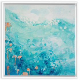
Upside Dream (2025) A two-panel work where stretched fabric pulls color into sharp folds, creating real contour that catches light and shifts as you move.
When you enter Gallery 85, directly across at the end of the room are Carrie Gillen’s two works. They are hard not to notice. Staring you down is a 48 x 96 diptych of folded fabric bursting with color in Carrie’s “Upside Dream.” If that work didn’t stop you in your tracks, “Wild And Precious” would. You immediately start asking the right questions. Was this fabric painted before it was pulled and stretched into all of these directions, or did the image come after the tension was built in. Carrie actually wants that reaction. “I want people to be intrigued and confused by how it happened. You have these straight lines, and these color-blocked pieces that create a very static image, and it just doesn’t feel like that’s how it should be happening over fabric. It feels like there should be something looser.” Both pieces glow under the gallery lighting and radiate rich, saturated color. This wall is the first thing you see after the hallway into the gallery, and it’s also the last wall you pass on your way back out to the elevator lobby.
Gallery 85 sits just before the elevator vestibule for some of New York City’s biggest businesses, so that first impression matters. Our curators always think about what kind of work can hold that wall with intention, not just fill it. It’s why Carrie’s pieces make so much sense here. The fabric literally creates contour, and the color does the rest. The work stays with you, and that is the point, because a space like this deserves something that holds up after the first glance.
Carrie’s process starts with the material, and she’s not using traditional canvas. “I use fabric that’s got more stretch than traditional canvas. It’s got a lot more give. It’s kind of like an athletic stretchy fabric.” That stretch is what allows the folds to become the structure, but it also has to be built to last. “that’s why we do the layers of acrylic medium and then gesso on top so that it can withstand the paint and keep its shape and still be really archival and strong.” The result is a surface that feels physical even before you get to color. “When it’s painted, it’ll have a leathery texture when it’s finally finished.”
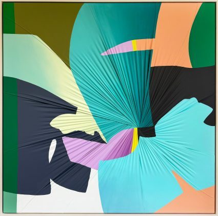
Wild And Precious (2025) A single-panel work where stretched fabric pulls color into a tight center point, turning hard-edged shapes into something that feels sculptural and alive.
And then color takes over. “I’m kind of a colored color nerd. I’m really into color theory and how the color interacts with the folds of the fabric, because it’s not a flat surface.” That is what makes her work such a natural fit for Contours. “The whole idea behind the work is texture is contour is, you know, creating form over a shape,” and you can see that clearly in both pieces. The folds create the form first, and then the hard-edged color choices push against that form, creating the tension that makes you stop and actually look.
That’s the value of work like Carrie’s in a space people pass through every day. It reads quickly, and it holds up over time because the surface is doing real heavy lifting. The folds create shadow and depth, the color shifts as the light changes, and every repeat viewing gives you a slightly different read. In a building where people are constantly moving in and out, that makes all the difference. You’re not asking anyone to stop and study. You’re giving them a visual that keeps showing up, even at a glance.
And that’s exactly what Carrie is aiming for once the work leaves the studio. “I hope my work makes people curious. I hope it makes people want to investigate how this thing came to be, how this image exists.” In Contours at Gallery 85, that curiosity becomes the point. A small interruption in the routine, a burst of color and structure that stays with you long after you’ve walked past it.
Written by David Dempsey, Director, Media Services & Content